On April 21, 2015, something very special indeed will take place - a well publicized update of Google's algorithm.
Google's algorithm updates are some of the world's best-kept secrets. Traditionally, people do not know when updates will take place, or what they will include, only ever finding out after the fact, and usually noticing because of its impact - fewer visitors. For Google to announce in advance exactly when an update will take place, and what that update will include means some very important changes are going to take place.
What is all the fuss about?
In 2014 the number of people accessing the Internet by mobile devices was more than those accessing the internet via PCs for the first time. As a result, as far as Google is concerned, it is now important that a website offer both mobile and PC users a worthwhile user experience, hence the shift in emphasis towards websites with responsive, or mobile-friendly designs.
Dubbed “Mobilegeddon”, on April 21, 2015 Google will update its algorithm to give more importance to websites that have a 'responsive' design and are more accessible to mobile devices. This basically means that you can see a website clearly using a mobile device (mobile phone, phablet, tablet, etc.) and use all its features. Traditionally, website design has been directed by PC usage, and these designs just don't fit mobile access well.
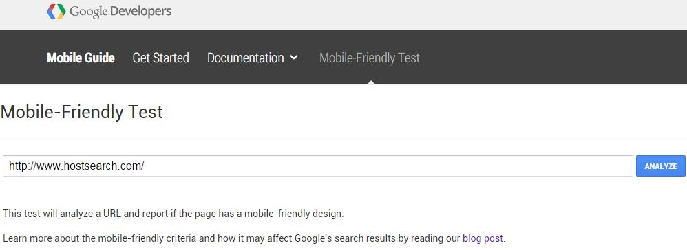
How do I know if my website is mobile friendly?
Further underscoring the importance Google is placing on mobile friendliness, the corporation has set up a tool you can use to get immediate feedback - the Mobile-Friendly Test. Add your website's URL and you will get a message: "Awesome! This page is mobile-friendly” is what you are aiming for. “Not mobile-friendly” is what you are trying to avoid. The tool will also generate a report that will establish what issues your website is facing.
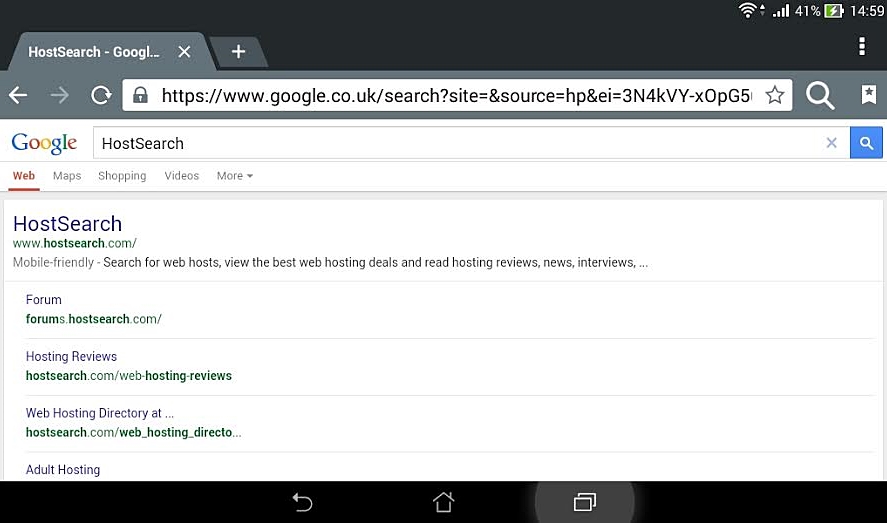
Obviously, with Google we can never be sure of the impact of an algorithm change, but essentially, given the lengths Google has gone to ensure that these changes have been well publicized, the SEO community is expecting April 21 to be a paradigm-changer, with the Internet split into 2 hostile camps: websites with responsive, mobile-friendly designs, and those without. Already (as of 8 April, 2015) mobile search results are showing if a website is mobile friendly or not.
Common thinking in the SEO community is that Google will label a site either mobile-friendly or not, and those that aren't will be penalized and languish in ranking below those sites that are. Those that fail Google's mobile-friendly test badly might not even be deemed worth ranking, so the thinking goes. However, for obvious reasons, these changes might NOT impact searches from a PC, so how far "Mobilegeddon" will impact overall ranking really is not clear at the moment.
So what do I do?
Well, in the next few days, you have to establish a mobile-friendly version of your website.
Simple as that. By far the easiest way of doing this would be to transfer to one of the more prevalent Content Management System (CMS) platforms.
The two most recognized platforms are WordPress and Joomla, and both have made great efforts to establish systems that generate mobile-friendly versions of websites. Joomla has made particular effort as far as this is concerned. Joomla 3.4.1 recently released with a focus on trimming the size of the core of the system to generate faster loading pages - another Google concern as far as user experience is concerned.
What is good about WordPress and Joomla is that you can recreate the website structure of your existing site. This means you can keep all your URLs as they are and as Google has liked them over the last number of years. Google doesn't therefore have to treat your responsive design as an entirely new website. The downside is that you need to migrate your entire site to a new platform - fast!
I don't have the skills (or time) to migrate to WordPress and Joomla!
It might also pay to run your website past a developer that specializes in mobile-friendly design. It may prove that with only a few tweaks you can pass muster as far as the Google Mobile-friendliness Test is concerned. Alternatively, it might prove that a major overhaul is required - and that is something that is good to know sooner than later! This isn't going to go way by ignoring it... So get to grips with it - now!
