Dedicated server, colocation and cloud hosting services provider
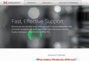
Hivelocity has launched a new logo. The move comes as a precursor to new products and services offered through the company’s new data centers. The logo epitomizes the company’s “clean and easy” design approach, and symbolizes both the letter ‘H’ – the first letter in the company’s name – and a server rack.
“Our approach to web hosting and infrastructure as a service has always been to make things simple for our customers,” explained says the CEO of Hivelocity, Mike Architetto. “While we deal with complex technology there is no reason things have to be difficult for our customers. Our message of simplicity has always been clear but some of our imagery has not always matched the idea.”
“Our old logo was much more abstract and represented speed through high-energy motion. Our new mark holds true to that message but now conveys speed through simplicity and efficiency,” added Mr. Architetto. “Our goal is to make life easier on our customers by providing a hosting environment that is easy, reliable and facilitates their success. I believe our new logo symbolizes that message beautifully.”
The company’s new logo can be seen at its
website.
Do you know of any other company’s changing their corporate image? Let us know the details. Add your comments below.
